
1. iPhoneX的介绍
屏幕尺寸
我们熟知的iPhone系列开发尺寸概要如下:
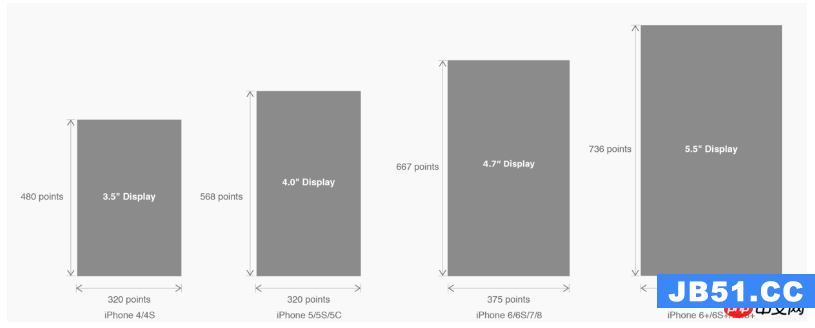
△ iPhone各机型的开发尺寸
转化成我们熟知的像素尺寸:

△ 每个机型的多维度尺寸
倍图其实就是像素尺寸和开发尺寸的倍率关系,但这只是外在的表现。倍图核心的影响因素在于PPI(DPI),了解屏幕密度与各尺寸的关系有助于我们深度理解倍率的概念:《基础知识学起来!为设计师量身打造的DPI指南》
iPhone8在本次升级中,屏幕尺寸和分辨率都遗传了iPhone6以后的优良传统;
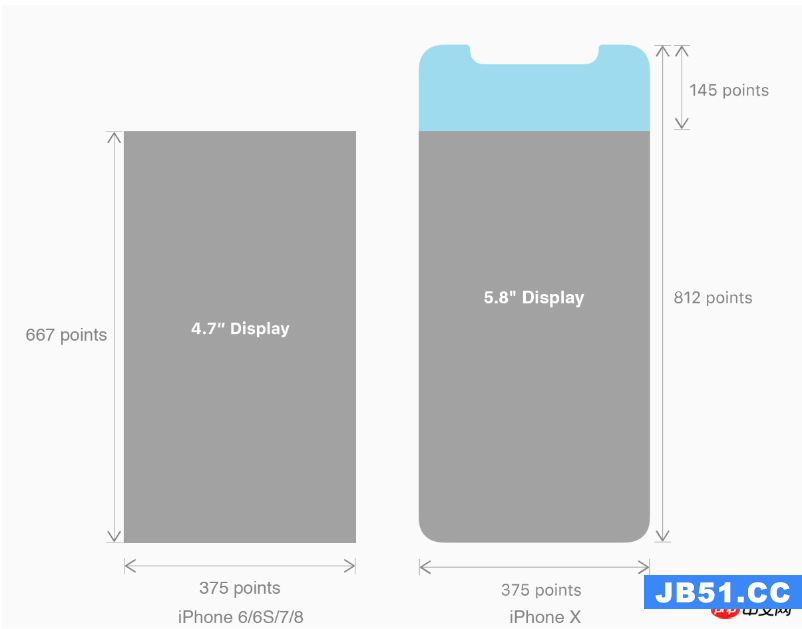
然而iPhone X 无论是在屏幕尺寸、分辨率、甚至是形状上都发生了较大的改变,下面以iPhone 8作为参照物,看看到底iPhone X的适配我们要怎么考虑。
我们看看iPhone X尺寸上的变化:
2. iPhoneX的适配---安全区域(safe area)
苹果对于 iPhone X 的设计布局意见如下:
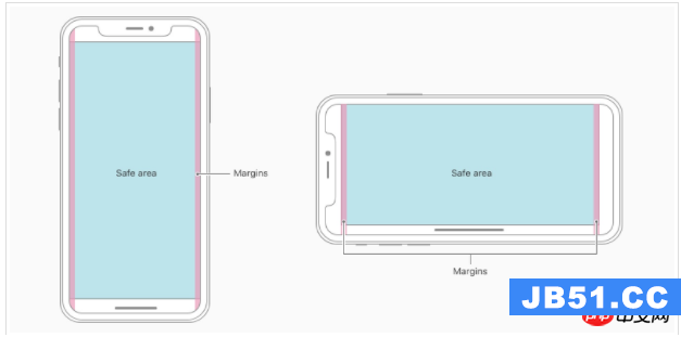
核心内容应该处于 Safe area 确保不会被设备圆角(corners),传感器外壳(sensor housing,齐刘海) 以及底部的 Home Indicator 遮挡。也就是说 我们设计显示的内容应该尽可能的在安全区域内;
3. iPhoneX的适配---适配方案viewport-fit 3.1 PhoneX的适配,在iOS 11中采用了viewport-fit的meta标签作为适配方案;viewport-fit的默认值是auto。
viewport-fit取值如下:
| auto | 默认:viewprot-fit:contain;页面内容显示在safe area内 |
| cover | viewport-fit:cover,页面内容充满屏幕 |
viewport-fit meta标签设置(cover时)
<meta name=viewport content=width=device-width,initial-scale=1.0, minimum-scale=1.0, maximum-scale=1.0, user-scalable=no, viewport-fit=cover>
3.2 css constant()函数 与safe-area-inset-top &safe-area-inset-left &safe-area-inset-right &safe-area-inset-bottom的介绍

如上图所示 在iOS 11中的WebKit包含了一个新的CSS函数constant(),以及一组四个预定义的常量:safe-area-inset-left,safe-area-inset-right,safe-area-inset-top和safe-area-inset-bottom。当合并一起使用时,允许样式引用每个方面的安全区域的大小。
3.1当我们设置viewport-fit:contain,也就是默认的时候时;设置safe-area-inset-left,safe-area-inset-right,safe-area-inset-top和safe-area-inset-bottom等参数时不起作用的。
3.2当我们设置viewport-fit:cover时:设置如下
body {
    padding-top: constant(safe-area-inset-top);   //为导航栏+状态栏的高度 88px
    padding-left: constant(safe-area-inset-left);   //如果未竖屏时为0
    padding-right: constant(safe-area-inset-right); //如果未竖屏时为0
    padding-bottom: constant(safe-area-inset-bottom);//为底下圆弧的高度 34px
}
4. iPhoneX的适配---高度统计
viewport-fit:cover + 导航栏

5.iPhoneX的适配---媒体查询
注意这里采用的是690px(safe area高度),不是812px;
@media only screen and (width: 375px) and (height: 690px){
    body {
        background: blue;
    }
}
6.iphoneX viewport-fit
问题总结
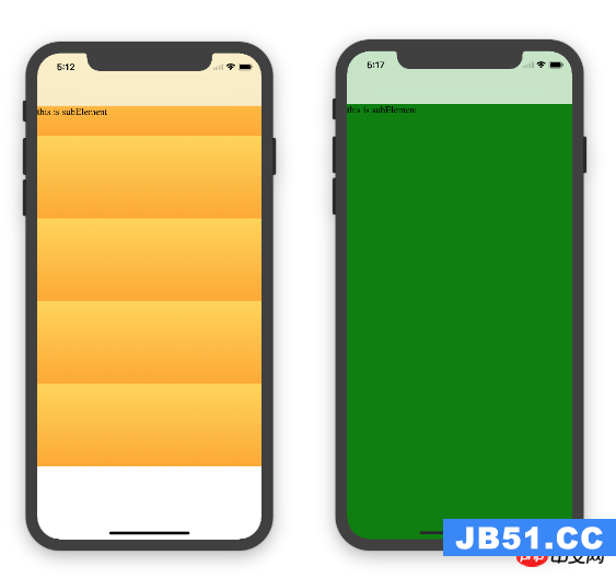
1.关于iphoneX 页面使用了渐变色时;如果viewport-fit:cover;
1.1在设置了背景色单色和渐变色的区别,如果是单色时会填充整个屏幕,如果设置了渐变色 那么只会更加子元素的高度去渲染;而且页面的高度只有690px高度,上面使用了padding-top:88px;
body固定为:
<body><p class=content>this is subElement</p></body>
1.单色时:
* {
           padding: 0;
           margin: 0;
       }
       body {
           background:green;
           padding-top: constant(safe-area-inset-top); //88px
           /*padding-left: constant(safe-area-inset-left);*/
           /*padding-right: constant(safe-area-inset-right);*/
           /*padding-bottom: constant(safe-area-inset-bottom);*/
       }
2.渐变色
* {
           padding: 0;
           margin: 0;
       }
       body {
           background:-webkit-gradient(linear, 0 0, 0 bottom, from(#ffd54f), to(#ffaa22));
           padding-top: constant(safe-area-inset-top); //88px
           /*padding-left: constant(safe-area-inset-left);*/
           /*padding-right: constant(safe-area-inset-right);*/
           /*padding-bottom: constant(safe-area-inset-bottom);*/
       }
解决使用渐变色 仍旧填充整个屏幕的方法;CSS设置如下

<!DOCTYPE html>
<html>
<head>
   <meta name=viewport content=initial-scale=1, viewport-fit=cover>
   <title>Designing Websites for iPhone X: Respecting the safe areas</title>
   <style>        * {
       padding: 0;
       margin: 0;
   }
   html, body {
       height: 100%;
   }
   body {
       padding-top: constant(safe-area-inset-top);
       padding-left: constant(safe-area-inset-left);
       padding-right: constant(safe-area-inset-right);
       padding-bottom: constant(safe-area-inset-bottom);
   }
   .content {
       background: -webkit-gradient(linear, 0 0, 0 bottom, from(#ffd54f), to(#ffaa22));
       width: 100%;
       height: 724px;
   }    </style>
</head>
<body>
<p class=content>this is subElement</p>
</body>
</html>
2.页面元素使用了固定定位的适配即:{position:fixed;}
2.1 子元素页面固定在底部时;使用viewport-fit:contain时;可以看到bottom:0时只会显示在安全区域内;

<!DOCTYPE html>
<html>
<head>
   <meta name=viewport content=initial-scale=1>
   <!--<meta name=viewport content=initial-scale=1, viewport-fit=cover>-->
   <title>Designing Websites for iPhone X: Respecting the safe areas</title>
   <style>
       * {
           padding: 0;
           margin: 0;
       }
       /*html,body {*/
           /*height: 100%;*/
       /*}*/
       body {
           background: grey;
           /*padding-top: constant(safe-area-inset-top);*/
           /*padding-left: constant(safe-area-inset-left);*/
           /*padding-right: constant(safe-area-inset-right);*/
           /*padding-bottom: constant(safe-area-inset-bottom);*/
       }
       .top {
           width: 100%;
           height: 44px;
           background: purple;
       }
       .bottom {
           position: fixed;
           bottom: 0;
           left: 0;
           right: 0;
           height: 44px;
           color: black;
           background: green;
       }
   </style>
</head>
<body>
   <p class=top>this is top</p>
   <p class=bottom>this is bottom</p>
</body>
</html>
2.1 子元素页面固定在底部时;使用viewport-fit:cover时;可以看到bottom:0时只会显示在安全区域内;

添加html,body {width:100%;heigth:100%}

图1:
* {
           padding: 0;
           margin: 0;
       }
       html,body {
           height: 100%;
       }
       body {
           background: grey;
           padding-top: constant(safe-area-inset-top);
           padding-left: constant(safe-area-inset-left);
           padding-right: constant(safe-area-inset-right);
           padding-bottom: constant(safe-area-inset-bottom);
       }
       .top {
           width: 100%;
           height: 44px;
           background: purple;
       }
       .bottom {
           position: fixed;
           bottom: 0;
           left: 0;
           right: 0;
           height: 44px;
           color: black;
           background: green;
       }
图2:
* {
           padding: 0;
           margin: 0;
       }
       html,body {
           height: 100%;
       }
       body {
           background: grey;
           padding-top: constant(safe-area-inset-top);
           padding-left: constant(safe-area-inset-left);
           padding-right: constant(safe-area-inset-right);
           /*padding-bottom: constant(safe-area-inset-bottom);*/
       }
       .top {
           width: 100%;
           height: 44px;
           background: purple;
       }
       .bottom {
           position: fixed;
           bottom: 0;
           left: 0;
           right: 0;
           height: 44px;
           color: black;
           background: green;
       }
2.3 关于alertView弹框 遮罩层的解决方案

<!DOCTYPE html>
<html lang=en>
<head>
   <meta charset=UTF-8>
   <!--<meta name=viewport content=width=device-width, initial-scale=1.0, minimum-scale=1.0, maximum-scale=1.0, user-scalable=no>-->
   <meta name=viewport content=width=device-width,initial-scale=1.0, minimum-scale=1.0, maximum-scale=1.0, user-scalable=no, viewport-fit=cover>
   <meta http-equiv=pragma content=no-cache>
   <meta http-equiv=cache-control content=no-cache>
   <meta http-equiv=expires content=0>
   <title>alertView</title>
   <script data-res=eebbk>
       document.documentElement.style.fontSize = window.screen.width / 7.5 + 'px';
   </script>
   <style>
       * {
           margin: 0;
           padding: 0;
       }
       html,body {
           width: 100%;
           height: 100%;
       }
       body {
           font-size: 0.32rem;
           padding-top: constant(safe-area-inset-top);
           padding-left: constant(safe-area-inset-left);
           padding-right: constant(safe-area-inset-right);
           padding-bottom: constant(safe-area-inset-bottom);
       }
       .content {
           text-align: center;
       }
       .testBut {
           margin: 50px auto;
           width: 100px;
           height: 44px;
           border: 1px solid darkgray;
           outline:none;
           user-select: none;
           background-color: yellow;
       }
   </style>
   <link href=alertView.css rel=stylesheet type=text/css>
</head>
<body>
   <section class=content>
       <button class=testBut onclick=showLoading()>弹框加载</button>
   </section>
   <script type=text/javascript src=alertView.js></script>
   <script>
       function showLoading() {
           UIAlertView.show({
               type:input,
               title:温馨提示,              //标题
               content:VIP会员即将到期,     //获取新的
               isKnow:false
           });
           var xx = new UIAlertView();
          console.log(xx);
       }
   </script>
</body>
</html>
相信看了本文案例你已经掌握了方法,更多精彩请关注编程之家网其它相关文章!
推荐阅读:
版权声明:本文内容由互联网用户自发贡献,该文观点与技术仅代表作者本人。本站仅提供信息存储空间服务,不拥有所有权,不承担相关法律责任。如发现本站有涉嫌侵权/违法违规的内容, 请发送邮件至 dio@foxmail.com 举报,一经查实,本站将立刻删除。