
如何解决响应式Web开发问题-重叠元素
到目前为止,我正在开发的网站存在问题,纯HTML,CSS和JS(FullPage.js)。
我的目标是,当宽度为一定大小时,所有元素都以页面为中心,并且使用fullpage.js导致页面溢出
What I see at 320x668 resolution

到目前为止,我遇到的问题如下,元素未按预期居中,并且重叠。
@media only screen and (max-width: 600px)
{
.s2
{
display: flex;
background-color: aqua;
flex-direction: column;
justify-content: center;
}
#abouttextdiv
{
width: 100%;
height: 100%;
}
#aboutTitle
{
font-family: fantasy;
width: 100%;
display: flex;
flex-direction: column;
padding: 10px;
left: 25%;
}
#makingtext
{
display: flex;
flex-direction: column;
text-align: center;
width: 100%;
padding-top: 20px;
left: 25%;
}
#sparkletext
{
display: flex;
flex-direction: column;
transform: translate(-50%,-50%);
font-family: 'Pacifico';
background: rgb(255,112,184);
-webkit-background-clip: text;
-webkit-text-fill-color: transparent;
width: 100%;
}
#beach_icon
{
position: flex;
flex-direction: column;
font-size: 48px;
}
#camera_icon
{
position: flex;
flex-direction: column;
padding-bottom: 20px;
font-size: 48px;
}
.aboutimagediv
{
display: none;
}
#aboutParagraphOne
{
position: flex;
flex-direction: column;
transform: translate(-50%,-50%);
font-size: 2vh;
text-align: center;
width: 100%;
padding-bottom: 20px;
}
#aboutParagraphTwo
{
position: flex;
flex-direction: column;
font-size: 2vh;
transform: translate(-50%,-50%);
text-align: center;
padding-bottom: 10px;
padding-top: 20px;
width: 100%;
}
#aboutParagraphThree
{
position: flex;
flex-direction: column;
left: 50%;
transform: translate(-50%,-50%);
font-size: 2vh;
padding-bottom: 10px;
padding-top: 20px;
width: 100%;
}
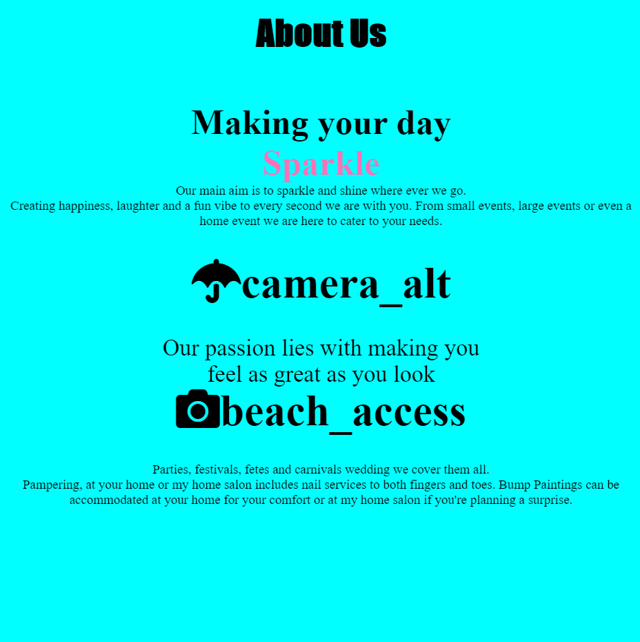
}<section class="section s2" id="aboutUs">
<h1 id="aboutTitle">About Us</h1>
<div class="aboutimagediv">
<img src="Media/Images/About_Page/hennaAndNails.jpg" alt="Image of Woman's nails with Glitter and Henna" class="aboutimage">
</div>
<div class="abouttextdiv">
<h2 id="makingtext">Making your day </h2>
<h2 id = "sparkletext">Sparkle</h2>
<!--<p id = "tagline">We run booths at events all around County</p><!-->
<!-- <p id="aboutParagraphOne">As a small business in Area,<br> we love all things glitter and Shine</p><!-->
<!-- <p id="aboutParagraphThree">You can find us at all the best events,<br> festivals and parties around Area!</p><!-->
<p id="aboutParagraphOne">Our main aim is to sparkle and shine where ever we go. <br> Creating happiness,laughter and a fun vibe to every second we are with you. From small events,large events or even a home event we are here to cater to your needs. </p>
<i class="material-icons" id="camera_icon">camera_alt</i>
<p id="aboutParagraphTwo">Our passion lies with making you <br> feel as great as you look </p>
<i class="material-icons" id="beach_icon">beach_access</i>
<p id="aboutParagraphThree">Parties,festivals,fetes and carnivals wedding we cover them all. <br> Pampering,at your home or my home salon includes nail services to both fingers and toes. Bump Paintings can be accommodated at your home for your comfort or at my home salon if you're planning a surprise.</p>
</div>
</section>如果我没有将“关于我们”的文字放在absolute的位置,而是给了它transform(-50%,-50%),则似乎将其强制显示在屏幕的左侧,而不是我认为的中心位置会。
如果有人可以帮助我发现我所缺少的内容,我将不胜感激。我了解这似乎很基本,但是我对W3CSchools和类似资源的搜索并没有减轻我的理解。
解决方法
您是否考虑过使用CSS Flexbox?只需在部分和div中添加带有flex-direction:列的Flex显示属性,即可为您提供所需的响应式垂直布局
,
@media only screen
  and (max-width: 600px) {

    #aboutUs {
      text-align: center;
    }

    #aboutTitle {
      font-family: fantasy;
    }

    #makingtext {
      width: 100%;
    }

    #sparkletext {
      font-family: 'Pacifico';
      background: rgb(255,112,184);
      -webkit-background-clip: text;
      -webkit-text-fill-color: transparent;
    }

    .s2 {
      background-color: aqua
    }

    #beach_icon {
      font-size: 124px;
    }

    #camera_icon {
      padding-bottom: 20px;
      font-size: 72px;
     }

    .aboutimagediv {
      display: none;
    }

    #aboutParagraphOne {
      font-size: 2.5vh;
      padding-bottom: 20px;
    }

    #aboutParagraphTwo {
      font-size: 2.5vh;
      text-align: center;
      padding-bottom: 10px;
      padding-top: 20px;
    }

    #aboutParagraphThree {
      font-size: 2.5vh;
      padding-bottom: 10px;
      padding-top: 20px;
    }
}
<section class="section s2" id="aboutUs">
<h1 id="aboutTitle">About Us</h1>
<div class="aboutimagediv">
<img src="Media/Images/About_Page/hennaAndNails.jpg" alt="Image of Woman's nails with Glitter and Henna" class="aboutimage">
</div>
<div class="abouttextdiv">
<h2 id="makingtext">Making your day </h2>
<h2 id = "sparkletext">Sparkle</h2>
<!--<p id = "tagline">We run booths at events all around County</p><!-->
<!-- <p id="aboutParagraphOne">As a small business in Area,<br> we love all things glitter and Shine</p><!-->
<!-- <p id="aboutParagraphThree">You can find us at all the best events,<br> festivals and parties around Area!</p><!-->
<p id="aboutParagraphOne">Our main aim is to sparkle and shine where ever we go. <br> Creating happiness,laughter and a fun vibe to every second we are with you. From small events,large events or even a home event we are here to cater to your needs. </p>
<i class="material-icons" id="camera_icon">camera_alt</i>
<p id="aboutParagraphTwo">Our passion lies with making you <br> feel as great as you look </p>
<i class="material-icons" id="beach_icon">beach_access</i>
<p id="aboutParagraphThree">Parties,festivals,fetes and carnivals wedding we cover them all. <br> Pampering,at your home or my home salon includes nail services to both fingers and toes. Bump Paintings can be accommodated at your home for your comfort or at my home salon if you're planning a surprise.</p>
</div>
</section>如果删除所有覆盖居中的静态位置,则
居中不是问题。还可以显示块...但是,对于较小的屏幕,它不能解决124px字体大小过大的问题。
,这就是您要尝试做的事情。
*,*::before,*::after {
  -webkit-box-sizing: border-box;
  -moz-box-sizing: border-box;
  box-sizing: border-box;
  margin: 0;
  padding: 0;
}


/* i changed the query from 600 to 900 so it can show once you run this sinppet
don't forget to change it to 600px once you copy the code
*/

@media only screen and (max-width: 900px) {
  .s2 {
    /* display: flex; */
    background-color: aqua;
    /* flex-direction: column; */
    /* justify-content: center; */
    height: 100%;
  }
  .abouttextdiv {
    width: 100%;
    height: 100%;
  }
  #aboutTitle {
    font-family: fantasy;
    /* width: 100%; */
    /* display: flex; */
    /* flex-direction: column; */
    padding: 10px;
    /* left: 25%; */
    text-align: center;
  }
  #makingtext {
    /* display: flex; */
    /* flex-direction: column; */
    text-align: center;
    /* width: 100%; */
    padding-top: 20px;
    /* left: 25%; */
  }
  #sparkletext {
    /* display: flex; */
    /* flex-direction: column; */
    /* transform: translate(-50%,-50%); */
    font-family: 'Pacifico';
    background: #ff70b8;
    -webkit-background-clip: text;
    -webkit-text-fill-color: transparent;
    width: 100%;
    text-align: center;
  }
  .icon-holder {
    text-align: center;
  }
  #beach_icon {
    /* position: flex; */
    /* flex-direction: column; */
    font-size: 28px;
  }
  #camera_icon {
    /* position: flex; */
    /* flex-direction: column; */
    padding-bottom: 20px;
    font-size: 28px;
    text-align: center;
  }
  .aboutimagediv {
    display: none;
  }
  .abouttextdiv {
    text-align: center;
  }
  .aboutParagraphOne {
    /* position: flex; */
    /* flex-direction: column; */
    /* transform: translate(-50%,-50%); */
    font-size: 2vh;
    text-align: center;
    width: 100%;
    padding-bottom: 20px;
  }
  .aboutParagraphTwo {
    /* position: flex; */
    /* flex-direction: column; */
    font-size: 2vh;
    /* transform: translate(-50%,-50%); */
    text-align: center;
    padding-bottom: 10px;
    padding-top: 20px;
    width: 100%;
  }
  .aboutParagraphThree {
    /* position: flex; */
    /* flex-direction: column; */
    /* left: 50%; */
    /* transform: translate(-50%,-50%); */
    font-size: 2vh;
    padding-bottom: 10px;
    padding-top: 20px;
    width: 100%;
  }
}
<link rel="stylesheet" href="https://cdnjs.cloudflare.com/ajax/libs/font-awesome/5.14.0/css/all.min.css" integrity="sha512-1PKOgIY59xJ8Co8+NE6FZ+LOAZKjy+KY8iq0G4B3CyeY6wYHN3yt9PW0XpSriVlkMXe40PTKnXrLnZ9+fkDaog==" crossorigin="anonymous" />
<section class="section s2" id="aboutUs">
<h1 id="aboutTitle">About Us</h1>
<div class="aboutimagediv">
<img src="assets/images/image.jpg" height="200" width="200" alt="Image of Woman's nails with Glitter and Henna" class="aboutimage">
</div>
<div class="abouttextdiv">
<h2 id="makingtext">Making your day </h2>
<h2 id="sparkletext">Sparkle</h2>
<!--<p id = "tagline">We run booths at events all around County</p><!-->
<!-- <p id="aboutParagraphOne">As a small business in Area,<br> festivals and parties around Area!</p><!-->
<p class="aboutParagraphOne">Our main aim is to sparkle and shine where ever we go. <br> Creating happiness,large events or even a home event we are here to cater to your needs. </p>
<div class="icon-holder">
<i class="fas fa-umbrella" id="camera_icon">camera_alt</i>
</div>
<p id="aboutParagraphTwo">Our passion lies with making you <br> feel as great as you look </p>
<div class="icon-holder">
<i class="fas fa-camera" id="beach_icon">beach_access</i>
</div>
<p class="aboutParagraphThree">Parties,at your home or my home salon includes nail services to both fingers and toes. Bump Paintings can be accommodated at your home for your comfort or at my home salon
if you're planning a surprise.</p>
</div>
</section>
如果那没有用,请告诉我。
,主要问题似乎是您在多个元素上使用了transform: translate(-50%,-50%);和left: 50%,这将(也)使它们垂直向上移动并使它们重叠。删除这些设置,或者如果您已经为非移动屏幕尺寸设置了类似的transform设置,请通过将其更改为left: 0和transform: none来“中和”它们。
版权声明:本文内容由互联网用户自发贡献,该文观点与技术仅代表作者本人。本站仅提供信息存储空间服务,不拥有所有权,不承担相关法律责任。如发现本站有涉嫌侵权/违法违规的内容, 请发送邮件至 dio@foxmail.com 举报,一经查实,本站将立刻删除。