
如何解决动态情况下的元素定位修复
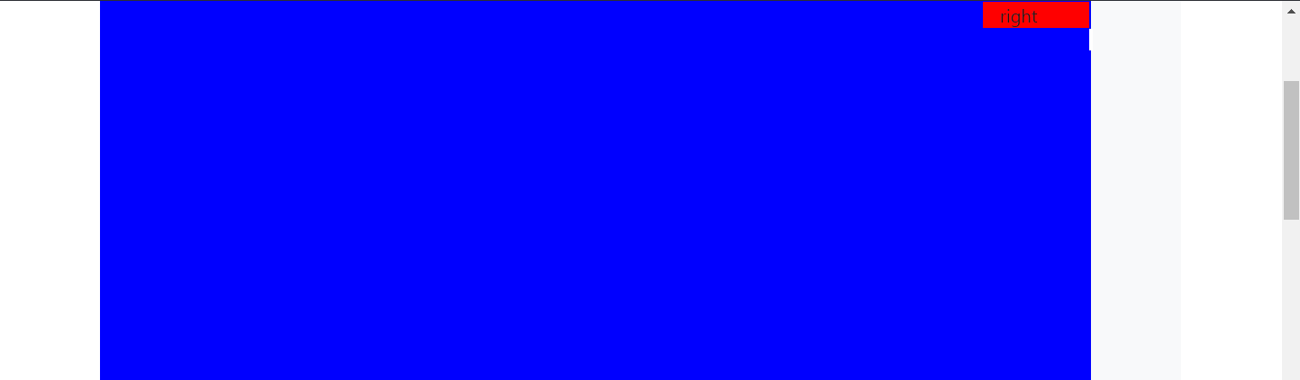
我正在使用Bootstrap,并且希望始终坐在红色背景的右上 到蓝色部分的右上角可见部分,无论窗口如何响应时如何调整大小。
红色应该固定位置,因为它不应该通过滚动来移动,但应始终位于可见的蓝色背景部分的右上角。
如图所示:

请检查link或查看以下代码:
.row {
  background: #f8f9fa;
  margin-top: 20px;
}

.col {
  border: solid 1px #6c757d;
  padding: 10px;
}

.left {
  background-color: blue;
  width: 100%;
  height: 4000px;
}

.right {
  background-color: red;
  width: 100%;
  position: fixed;
  right: 18%;
}
<link href="https://stackpath.bootstrapcdn.com/bootstrap/4.5.2/css/bootstrap.min.css" rel="stylesheet" />
<div class="container">
<div class="row">
<div class="col-11 left">left
</div>
<div class="col-1 right">right
</div>
</div>
</div>解决方法
如果要将元素设置在右上方,并且该元素应位于另一个元素的外部而无需滚动,则可以使用 position:absolute 属性 试试这个解决方案:
.right{
  background-color: red;
  width: '100%';
  position: absolute;
  right: 15%;
  top: 30px;
}
在这种情况下,您正在寻找position: sticky。要完成这项工作,您需要做一些事情:
- 在元素的父元素上设置
position: relative(在本例中为.row) - 在粘滞元素上设置
top值。这是必需的,因此当元素切换为粘性时,它知道将其放置在何处。 - 我将另一个类添加到
.right元素中,因为Bootstrap的col类更具体。将类.sticky添加到该元素,确保已应用position属性。
.row {
  background: #f8f9fa;
  margin-top: 20px;
  align-items: flex-start;
  position: relative;
}


.left {
  background-color: blue;
  width: 100%;
  height: 4000px;
}

.right.sticky {
  background-color: red;
  width: 100%;
  position: sticky;
  right: 18%;
  top: 0;
}
<link href="https://stackpath.bootstrapcdn.com/bootstrap/4.5.2/css/bootstrap.min.css" rel="stylesheet" />
<div class="container">
<div class="row">
<div class="col-11 left">left
</div>
<div class="col-1 right sticky">right
</div>
</div>
</div>
版权声明:本文内容由互联网用户自发贡献,该文观点与技术仅代表作者本人。本站仅提供信息存储空间服务,不拥有所有权,不承担相关法律责任。如发现本站有涉嫌侵权/违法违规的内容, 请发送邮件至 dio@foxmail.com 举报,一经查实,本站将立刻删除。