
如何解决CSS 3D动画轮偏心
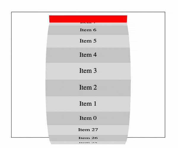
我有一个在x轴上旋转的3D CSS轮/圆柱动画。我的问题是动画似乎在容器的外部上下移动。下面的示例GIF ...
以上代码可在此处找到:https://jsfiddle.net/thelevicole/bkt0v1mc/
(function($) {

  const $wheel = $('.wheel .wheel__inner');
  const items = 28;
  const diameter = $wheel.height();
  const radius = diameter / 2;
  const angle = 360 / items;
  const circumference = Math.PI * diameter;
  const height = circumference / items;

  for (let i = 0; i < items; i++) {
    var transform = `rotateX(${ angle * i }deg) translateZ(${ radius }px)`;

    $('<div>',{
      class: 'wheel__segment'
    }).css({
      'transform': transform,'height': height,}).html(`<span>Item ${ i }</span>`).appendTo($wheel);
  }

})(jQuery);
*,*:before,*:after {
box-sizing: border-box;
}
.wheel {
perspective: 1000px;
border: 1px solid #333;
margin: 50px;
}
.wheel .wheel__inner {
background-color: red;
position: relative;
width: 200px;
height: 350px;
margin: 0 auto;
transform-style: preserve-3d;
animation-iteration-count: infinite;
animation-timing-function: linear;
animation-name: spin;
animation-duration: 6s;
}
.wheel .wheel__inner .wheel__segment {
display: flex;
justify-content: center;
align-items: center;
width: 100%;
height: 40px;
position: absolute;
top: 50%;
background-color: #ccc;
}
.wheel .wheel__inner .wheel__segment:nth-child(even) {
background-color: #ddd;
}
@-webkit-keyframes spin {
0% {
transform: rotateX(360deg);
}
50% {
transform: rotateX(180deg);
}
100% {
transform: rotateX(0deg);
}
}<script src="https://cdnjs.cloudflare.com/ajax/libs/jquery/3.3.1/jquery.min.js"></script>
<div class="wheel">
<div class="wheel__inner">
</div>
</div>红色窗格是segment容器,这是带有CSS动画的元素。红色窗格停留在容器内,但是这些段在垂直方向上偏移,从而将它们推到了容器之外。
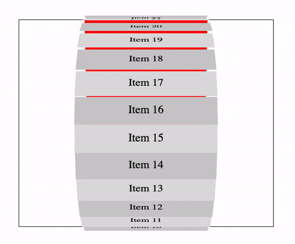
我可以通过在每个段中添加transform-origin: 50% 0;来停止上下移动,但这带来了一个新问题。段之间的差距!见下文...
以上代码:https://jsfiddle.net/thelevicole/bkt0v1mc/1/
( function( $ ) {

    const $wheel = $( '.wheel .wheel__inner' );
    const items = 28;
    const diameter = $wheel.height();
    const radius = diameter / 2;
    const angle = 360 / items;
    const circumference = Math.PI * diameter;
    const height = circumference / items;

    for ( let i = 0; i < items; i++ ) {
        var transform = `rotateX(${ angle * i }deg) translateZ(${ radius }px)`;

        $( '<div>',{
            class: 'wheel__segment'
        } ).css( {
            'transform': transform,} ).html( `<span>Item ${ i }</span>` ).appendTo( $wheel );
    }

} )( jQuery );
*,*:after {
box-sizing: border-box;
}
.wheel {
perspective: 1000px;
border: 1px solid #333;
margin: 50px;
}
.wheel .wheel__inner {
background-color: red;
position: relative;
width: 200px;
height: 350px;
margin: 0 auto;
transform-style: preserve-3d;
animation-iteration-count: infinite;
animation-timing-function: linear;
animation-name: spin;
animation-duration: 6s;
}
.wheel .wheel__inner .wheel__segment {
display: flex;
justify-content: center;
align-items: center;
width: 100%;
height: 40px;
position: absolute;
top: 50%;
background-color: #ccc;
transform-origin: 50% 0;
}
.wheel .wheel__inner .wheel__segment:nth-child(even) {
background-color: #ddd;
}
@-webkit-keyframes spin {
0% {
transform: rotateX(360deg);
}
50% {
transform: rotateX(180deg);
}
100% {
transform: rotateX(0deg);
}
}<script src="https://cdnjs.cloudflare.com/ajax/libs/jquery/3.3.1/jquery.min.js"></script>
<div class="wheel">
<div class="wheel__inner">
</div>
</div>任何帮助都会很棒!
解决方法
您可以通过调整旋转元素的transform-origin来纠正此问题,如下所示:
transform-origin: 50% calc(50% + height/2);
( function( $ ) {

    const $wheel = $( '.wheel .wheel__inner' );
    const items = 28;
    const diameter = $wheel.height();
    const radius = diameter / 2;
    const angle = 360 / items;
    const circumference = Math.PI * diameter;
    const height = circumference / items;

    for ( let i = 0; i < items; i++ ) {
        var transform = `rotateX(${ angle * i }deg) translateZ(${ radius }px)`;

        $( '<div>',{
            class: 'wheel__segment'
        } ).css( {
            'transform': transform,'height': height,} ).html( `<span>Item ${ i }</span>` ).appendTo( $wheel );
    }
  $wheel.css('transform-origin','50% calc(50% + '+height/2+'px)');
  $wheel.css('margin-top','-'+height+'px'); /* negative margin here to keep the element into the center */

} )( jQuery );
*,*:before,*:after {
box-sizing: border-box;
}
.wheel {
perspective: 1000px;
border: 1px solid #333;
margin: 50px;
}
.wheel .wheel__inner {
background-color: red;
position: relative;
width: 200px;
height: 350px;
margin: 0 auto ;
transform-style: preserve-3d;
animation-iteration-count: infinite;
animation-timing-function: linear;
animation-name: spin;
animation-duration: 6s;
}
.wheel .wheel__inner .wheel__segment {
display: flex;
justify-content: center;
align-items: center;
width: 100%;
height: 40px;
position: absolute;
top: 50%;
background-color: #ccc;
}
.wheel .wheel__inner .wheel__segment:nth-child(even) {
background-color: #ddd;
}
@-webkit-keyframes spin {
0% {
transform: rotateX(360deg);
}
50% {
transform: rotateX(180deg);
}
100% {
transform: rotateX(0deg);
}
}<script src="https://cdnjs.cloudflare.com/ajax/libs/jquery/3.3.1/jquery.min.js"></script>
<div class="wheel">
<div class="wheel__inner">
</div>
</div>
版权声明:本文内容由互联网用户自发贡献,该文观点与技术仅代表作者本人。本站仅提供信息存储空间服务,不拥有所有权,不承担相关法律责任。如发现本站有涉嫌侵权/违法违规的内容, 请发送邮件至 dio@foxmail.com 举报,一经查实,本站将立刻删除。