
html代码是这样的
<div class="arrow-up">
     <!--向上的三角-->
</div>
<div class="arrow-down">
    <!--向下的三角-->
</div>
<div class="arrow-left">
    <!--向左的三角-->
</div>
<div class="arrow-right">
    <!--向右的三角-->
</div>

下面用CSS3分别实现向上、下、左、右的三角形
/*箭头向上*/
.arrow-up {
    width:0;
    height:0;
    border-left:30px solid transparent;
    border-right:30px solid transparent;
    border-bottom:30px solid #fff;
}

 /*箭头向下*/
.arrow-down {
    width:0;
    height:0;
    border-left:20px solid transparent;
    border-right:20px solid transparent;
    border-top:20px solid #0066cc;
}

 /*箭头向左*/
.arrow-left {
    width:0;
    height:0;
    border-top:30px solid transparent;
    border-bottom:30px solid transparent;
    border-right:30px solid yellow;
}

/*箭头向右*/
.arrow-right {
    width:0;
    height:0;
    border-top:50px solid transparent;
    border-bottom: 50px solid transparent;
    border-left: 50px solid green;
}
小程序示例
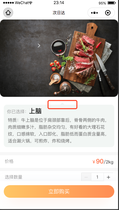
wxml
<view class="index_sale_lists">
      <view class="sanjiao"></view>
      <view class="index_sale_list">
        <view class="index_sale_choice">你已选择:<text>上脑</text></view>
        <view class="index_sale_tezhi">
          <text>
            特质:牛上脑是位于肩颈部靠后,脊骨两侧的牛肉,肉质细嫩多汁,脂肪杂交均匀,有好看的大理石花纹,口感绵软,入口即化,脂肪低而蛋白质含量高,适合涮火锅,可煎炸,炸和烧烤。
          </text>
        </view>
      </view>
    </view>
wxss
.index_sale_lists{
  margin: 50rpx 24rpx 0;
  background-color: #F2F6F4;
  border-radius: 20rpx;
  position: relative;
}
.sanjiao{
    position: absolute;
    left: 50%;
    top:-15rpx;
    width:0;
    height:0;
    border-left:10px solid transparent;
    border-right:10px solid transparent;
    border-bottom:10px solid #F2F6F4;
    /* z-index:-1; */
}
原文地址:https://www.cnblogs.com/zmdComeOn
版权声明:本文内容由互联网用户自发贡献,该文观点与技术仅代表作者本人。本站仅提供信息存储空间服务,不拥有所有权,不承担相关法律责任。如发现本站有涉嫌侵权/违法违规的内容, 请发送邮件至 dio@foxmail.com 举报,一经查实,本站将立刻删除。