

<h1 id="页面布局">1、页面布局
<h3 id="题目假设高度已知请写出三栏布局其中左栏右栏宽度为300px中间自适应">题目:假设高度已知,请写出三栏布局,其中左栏右栏宽度为300px,中间自适应?
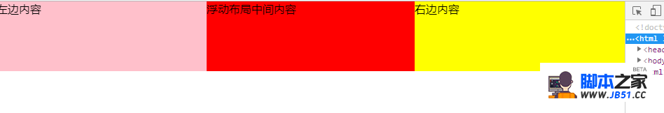
<h3 id="浮动">1、浮动
- 浮动布局
- 优点:兼容性比较好
- 缺点:浮动后,元素是脱离文档流的,需要处理清除浮动clear:both;处理好与周边元素关系
div是left-right-center
效果图
css
* {
margin: 0;
padding: 0;
}
.layout .content div{
min-height: 100px;
}
.layout .content .left{
float: left;
width: 300px;
background: pink;
}
.layout .content .right{
float: right;
width: 300px;
background: yellow;
}
.layout .content .center {
background: red;
}</code></pre>
html
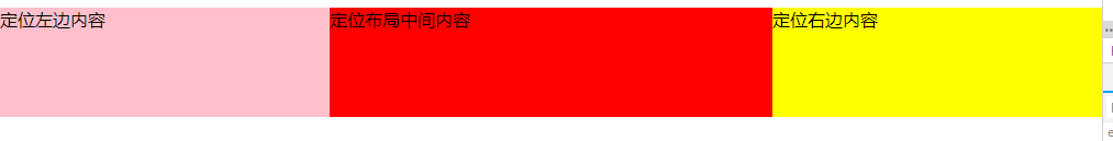
- 绝对定位布局
- 优点:布局相对迅速
缺点: 定位的元素脱离了文档流,意味着子元素也要脱离文档流,所以这种方式的可使用性比较差
效果图
css
.layout-absolute .absolute-content {
position: relative;
}
.layout-absolute .absolute-content div {
min-height: 100px;
}
.layout-absolute .absolute-content .left {
position: absolute;
left: 0;
width: 300px;
background: pink;
}
.layout-absolute .absolute-content .right {
position: absolute;
right: 0;
width: 300px;
background: yellow;
}
.layout-absolute .absolute-content .center {
position:absolute;
left: 300px;
right: 300px;
background: red;
}
html
- flex
- 优点: 非常有效的解决了浮动和绝对定位的问题
缺点:兼容性比较差(css3的属性),不兼容IE8及以下
效果图
css
.flexbox-content {
display: flex;
width: 100%;
}
.flexbox-content div {
min-height: 100px;
}
.flexbox-content .left {
width: 300px;
background: pink;
}
.flexbox-content .right {
width: 300px;
background: yellow;
}
.flexbox-content .center {
flex: 1;
background: red;
}
html
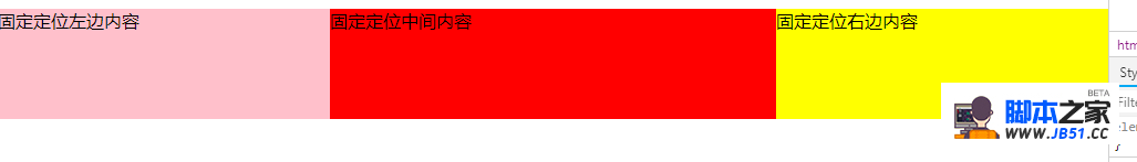
- 表格布局
- 优点:兼容性非常好,弥补了flex布局兼容的问题
缺点:操作繁琐,当三栏中其中某一栏高度超出时,其他两栏的高度也会自动跟着调整(不符合某些场景)
效果图

css
.table-content {
display: table;
width: 100%;
}
.table-content div{
display: table-cell;
height: 100px;
}
.table-content .left {
width: 300px;
background: pink;
}
.table-content .center {
background: red;
}
.table-content .right {
width: 300px;
background: yellow;
}
html
- 效果图

css
.grid-content {
display: grid;
width: 100%;
grid-template-rows: 100px;
grid-template-columns: 300px auto 300px;
}
.grid-content .left {
background: pink;
}
.grid-content .center {
background: red;
}
.grid-content .right {
background: yellow;
}
html
- 假如把高度已知去掉或者高度超出
- 1.flex布局高度可以自适应
- 2.表格布局高度可以自适应
- 3.浮动,绝对定位,网格布局不能自适应高度
版权声明:本文内容由互联网用户自发贡献,该文观点与技术仅代表作者本人。本站仅提供信息存储空间服务,不拥有所有权,不承担相关法律责任。如发现本站有涉嫌侵权/违法违规的内容, 请发送邮件至 [email protected] 举报,一经查实,本站将立刻删除。
相关推荐
- • 一次彻底讲清如何处理mysql 的死锁问题
- • MySQL 通过 Next-Key Locking 技术(行
- • 一文彻底弄懂mysql的事务日志,undo lo
- • Linux系统控制文件 /etc/sysctl.conf详
- • linux命令useradd添加用户详解
- • vi 和vim 的区别
- • Linux系统下如何监测磁盘的使用空间
- • linux中查看和开放端口
- • Linux设置开放一个端口
- • linux之ftp命令详解
- • linux系统下实时监控进程以及定位杀死挂
- • Linux下安装jdk8的方法
- • 阿里云被挖矿进程wnTKYg入侵的解决方法
- • 莫小安 CentOS7使用firewalld打开关闭防
- • Linux中more和less命令用法
- • linux系统里/opt目录和/usr/local目录的
- • 如何使用Siege进行压测?
- • 本地访问服务器的nacos地址