
文章目录
说明
这里以R自带的数据集mtcars说明ggplot绘图中一些常见技巧
mtcars数据摘自1974年《Motor Trend US》杂志,包括32种汽车的燃油消耗和10个汽车设计和性能方面的数据。help(‘mtcars’),查看该数据集详细介绍。这里以mpg(每加仑跑的英里数)和wt(汽车重量)绘制散点图。
包管理
- pacman自动安装加载
if(!requireNamespace('pacman')){install.packages('pacman')} #pacman R包管理器
library(pacman)
pacman::p_load(randomForest, caret, pROC) #若不存在上述包则自动下载安装和加载
- 设置镜像
options(repos=structure(c(CRAN="https://mirrors.tuna.tsinghua.edu.cn/CRAN/")))
- BioManager镜像
options(BioC_mirror="https://mirrors.tuna.tsinghua.edu.cn/bioconductor")
* 安装包
```bash
if(!requireNamespace('RColorBrewer',quietly = T)){install.packages('RColorBrewer')}
library(RColorBrewer)
新建ggplot空白对象
P <- ggplot() + theme_void() # 空白ggplot2对象
字体
## 1. 新罗马字体、字体大小、加粗、标题居中

    ggplot(mtcars,aes(mpg,wt,fill=wt))+geom_point()+
    ggtitle('cars')+
    theme(text=element_text(size=13,family='Times New Roman',face='bold'),plot.title = element_text(hjust=0.5))

    ggplot(head(data),aes(Gene,Length,fill=Gene))+geom_bar(stat='identity')+


    theme(axis.text.x = element_text(angle = 45, hjust = 1, vjust = 1),text=element_text(size=12,family='Times New Roman',face='bold'),plot.title = element_text(hjust=0.5))
排序
    ggplot(d,aes(x=reorder(Gene,Usage),y=Usage,fill=Group)) + geom_boxplot() + xlim("TRBV30","TRBV6.4","TRBV12.3","TRBV12.4","TRBV6.5","TRBV6.9","TRBV6.8","TRBV27","TRBV28","TRBV20.1","TRBV6.2","TRBV6.3","TRBV6.1") + ylim(0,2e+05) + ggtitle("V gene usage") + theme(plot.title=element_text(hjust=0.5,vjust=0.5),panel.grid.major=element_blank(),panel.grid.minor=element_blank(),panel.background=element_blank(),axis.line=element_line(colour="black"),axis.text.x=element_text(color="black",size=10),axis.text.y=element_text(color="black",size=10)) + xlab("Gene")
    +theme(plot.margin = unit(c(1,1,1,1), "cm")) #上下右左

* 倒序
在排序项前加-

    ggplot(d,aes(x=reorder(Gene,-Usage),y=Usage,fill=Group)) + geom_boxplot()
- ggplot 按组排序和按水平排序
ggplot(kegg,aes(x=description,y=numbers,fill=group)) + geom_bar(stat="identity") + xlim("Olfactory transduction","Cytosolic DNA-sensing pathway","Salmonella infection","NF-kappa B signaling pathway","Toll-like receptor signaling pathway","Chemokine signaling pathway","Human cytomegalovirus infection","Systemic lupus erythematosus","Natural killer cell mediated cytotoxicity","JAK-STAT signaling pathway","Alcoholism","Viral carcinogenesis","Cytokine-cytokine receptor interaction","PI3K-Akt signaling pathway","Autoimmune thyroid disease","Graft-versus-host disease") + theme(axis.text.x=element_text(size=12,color="black",angle=80,hjust=.75,vjust=.80),axis.text.y=element_text(size=10,color="black"),panel.background=element_blank(),panel.grid.major=element_blank(),panel.grid.minor=element_blank(),axis.line=element_line(color="black"),legend.title=element_blank(),axis.title=element_text(size=15)) + xlab("Pathway") + scale_fill_brewer(palette="Set2")
- 按factor排序
data$group<-factor(data$group,level=c('b','a','c'))
#在绘图的时候就会按照b-a-c的顺序排序了
图例
- 修改图例标题
* 安装包
```bash
labs(color = 'Type')
labs(fill='group')
- 移除图例
guides(fill=FALSE)
theme(legend.position="none")
- 设置图例位置
theme(legend.position = c(0.8,0.8))
- 图例背景透明
legend.background = element_blank()
背景色及网格线
theme_bw()  + #去掉背景色
theme(panel.grid=element_blank()) #去掉网格线
panel.grid 绘图区网格线
panel.grid.major 主网格线
panel.grid.minor 次网格线
panel.border 绘图区边框
axis.title.x x轴属性 axis.title
axis.title.y y轴属性
加垂直/水平线
geom_vline(aes(xintercept=10000), colour="grey", linetype="dashed")
xintercept为轴所在刻度
加p-value
t.test相比wilcox会更精确,但前提t.test需要服从正态方差齐性,即需要做shapnio和F-test;而wilcox则是通用的。
 p+stat_compare_means()
 p+stat_compare_means(label = "p.signif",comparisons = combn(levels(data$type), 2, simplify =FALSE))+
library(ggpubr)
ggplot(data, aes(x = type, y = len, fill = type)) +geom_boxplot(position = position_dodge(0.8)) +theme_classic(base_size = 16)+labs(x = "Type", y = 'Length')+
    stat_compare_means() +   stat_compare_means(label = "p.signif",comparisons = combn(levels(data$type), 2, simplify =FALSE))+theme(text=element_text(size=13,family='Times New Roman'),plot.title = element_text(hjust=0.5))
直接从CRAN安装
install.packages(“ggpubr”, repo=“http://cran.us.r-project.org”)
#先加载包
library(ggpubr)
#加载数据集ToothGrowth
data(“ToothGrowth”)
head(ToothGrowth)
> compare_means(len~supp, data=ToothGrowth)
A tibble: 1 x 8
y. group1 group2 p p.adj p.format p.signif method
1 len OJ VC 0.0645 0.064 0.064 ns Wilcoxon
ggboxplot(ToothGrowth, x="supp", y="len", color = "supp",
    +      palette = "jco", add = "jitter")
    #添加p-value, 默认是Wilcoxon test

    ggboxplot(data, x="type", y="len", color = "type",palette = "npg", add = "jitter")+stat_compare_means()+stat_compare_means(label = "p.signif",comparisons = combn(levels(data$type), 2, simplify =FALSE))+theme(text=element_text(size=13,face='bold'),plot.title = element_text(hjust=0.5))+xlab("Type")+ylab('Length')
参考:
https://www.jianshu.com/p/b7274afff14f
https://www.jianshu.com/p/e30d99b31bb5
显示特殊字符
使用paste()与expression()进行组合
plot(cars)
title(main = expression(paste(Sigma[1], ' and ', Sigma^2)))
或者
用expression(),其中下标为[],上标为^,空格为~,连接符为*。示例代码如下:
plot(cars)
title(main = expression(Sigma[1]~'a'*'n'*'d'~Sigma^2))
[外链图片转存失败,源站可能有防盗链机制,建议将图片保存下来直接上传(img-yi6dwo3A-1596461763945)(en-resource://database/1973:1)]
加数值标签
+geom_text(aes(label=numbers),position=position_dodge(0.9),vjust=-0.5)
#-0.5 表示在bar图上面0.5的位置
自由添加文字
annotate("text",x = 10,y = 80,label = 'test')

交换坐标轴
- 交换/颠倒x/y坐标轴
+ coord_flip()
颠倒坐标轴顺序
默认x/y都是从0-无穷大,如果想颠倒顺序,例如想将y轴改成从原点是max到0,只需要
ylim(100, 0) # y轴原点是100
x轴长标签,倾斜角度以及调整边缘
+theme(axis.text.x = element_text(angle = 45, hjust = 1, vjust = 1),text=element_text(size=12,family='Times New Roman',face='bold'),plot.title = element_text(hjust=0.5))+theme(plot.margin = unit(c(1,1,0.5,1.5), "cm"))
不均匀刻度
s = c(0, 10, 100, 1000, 10000)
scale_x_log10(label = s, breaks = s)
读入的表格是数字开头
设置read.table(check.names=F)
分页画图
p+facet_wrap(. ~ Sample)
    #按照Sample变量分组
ggplot(data,aes(reorder(Pathway,-Numbers),Numbers,fill=Pathway))+geom_bar(stat='identity',position='dodge')+xlab('Pathway')+geom_text(aes(label=Numbers),position=position_dodge(0.9),vjust=-0.5)+theme(axis.text.x = element_text(angle = 45, hjust = 1, vjust = 1),text=element_text(size=12,face='bold'),plot.title = element_text(hjust=0.5))+theme(plot.margin = unit(c(1,1,0.5,1.), "cm"))+guides(fill=FALSE)+facet_wrap(. ~ Sample)
拼图
pacman::p_load(patchwork)
p1 + p2

p1 + plot_spacer() #plot_spacer()为空白占位

#+ 会自从向右排列,同时当数量多的时候换行排列;
#按照row来拼,用/,
#按照column来拼,用/和|配以()和换行
P <- (p1 | p2 | p3 | p4 | p5) / (p6 | p7 | p8 | p9 | p10) #1-5按照列从左向右排列,6-10也是如此,然后将二者自上而下按行排列,最好结果:
p1 p2 p3 p4 p5
p6 p7 p8 p9 p10


p1 + p2 + p3 + p4 +
  plot_layout(widths = c(3, 1)) # 左右两格按照3:1
保存pdf
ggsave("plot2.pdf", plot, width =8, height = 7)
dev.off()
设置画图面板分区
 par(mfrow=c(2,2)) #2行2列的图
 par()的作用直到面板被关闭终止
调色板palette()
palette(c('red','blue','green'))    #设置调色板
palette()   #查看当前调色板
palette('default')  #使用8种颜色的默认调色板
颜色表示
-
名称,例如’red’,‘blue’,可通过colors()查看所有的颜色名称
-
RGB,即red,green,blue的0-255的值例如(255,255,255),数值越大颜色属性越强
-
十六进制,以#开头加6位字符,例如#c51b7d,分别表示红绿蓝的数值。
heat.colors(5) #选择5种渐进颜色,一般可与映射变量长度一起使用heat.colors(length(var))
另一个是rainbow()函数,rainbow(length(var))
可通过
http://colorbrewer2.org/
手工指定调整选择配色 -
调色板 RColorBrewer
if(!requireNamespace('RColorBrewer',quietly = T)){install.packages('RColorBrewer')}
library(RColorBrewer)
display.brewer.all()    #显示所有调色板效果
brewer.pal(5,'Set1')    #设置当前调色板主题为Set1,选择5种颜色
#"#E41A1C" "#377EB8" "#4DAF4A" "#984EA3" "#FF7F00"
display.brewer.pal(5,'Set1')    #显示效果

密度曲线
ggplot(bac_fun_stat,aes(class,color=group))+geom_density()+ #密度曲线
xlab('Degree')+ylab('Frequency')+theme_bw() + theme(panel.grid=element_blank())+ #去掉网格线
theme(panel.border = element_rect(color = 'black', size = 1, linetype='solid')) +  #设置背景边框
theme(legend.position = c(0.1, 0.8), legend.title = element_blank()) +  #设置图例位置并隐藏图例标题
scale_color_brewer(palette = 'Set2') #使用调色板
第一行输出错位
mat <- matrix(1:4, 2)
mat
rownames(mat) <- c('r1', 'r2')
colnames(mat) <- c('c1', 'c2')
mat <- cbind(rownames(mat), mat)
write.table(mat, 'C:/Users/yut/Desktop/test.tsv', quote = F, row.names = F, sep = "\t")
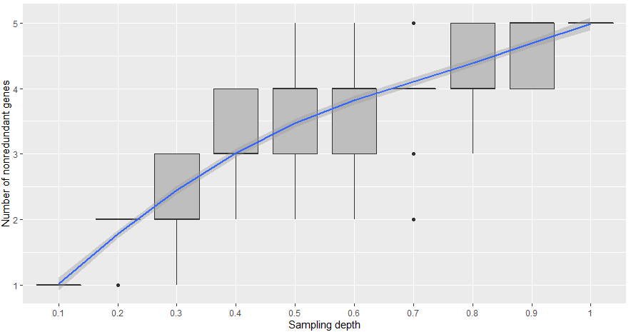
geom_boxplot + geom_smooth
library(ggplot2)
d <- read.table('test.txt')
head(d)
#V1  V2 V3
#1  1 0.1  1
#2  1 0.2  1

# 绘制boxplot+geom_smooth的散点图趋势的拟合
ggplot(data = d, aes(x = factor(V2), # 将抽样深度变成因子
                     y = V3, fill = V2)) +
  geom_boxplot(alpha = 1, fill = 'grey') +
  geom_smooth(method = 'loess', # 拟合曲线所用到的统计算法,当数据集记录小于1000时,method的默认参数即为loess,大于1000时则为gam。
              se = T , #se代表着误差范围曲线两侧的带
              aes(group = 1)) + # fixing the line smoothing are the coefficients of the linear regression, whereas the intercept corresponds to the lowest level of the factor (carb = 1)
  xlab('Sampling depth') +
  ylab('Number of nonredundant genes')

dim(d)
饼图
monthdata<-read.csv("Feast.csv",row.names=1,head=T)
monthdata$Room<-substr(rownames(monthdata),1,1)
monthdata_A<-monthdata[monthdata$Room=="A",]
monthdata_B<-monthdata[monthdata$Room=="B",]
A<-matrix(colMeans(monthdata_A[,1:7]),nrow=1)
B<-matrix(colMeans(monthdata_B[,1:7]),nrow=1)
c<-rbind(A,B)
rownames(c)<-c("A","B")
colnames(c)<-colnames(monthdata)[1:7]
write.csv(c,"A_month.csv")
#ICU-A的饼图,按照固定顺序
library(RColorBrewer)
library(reshape2)
getPalette=colorRampPalette(brewer.pal(7,"Accent"))
A_month<-read.csv("A_month.csv")   #把human去掉
Amonth<-melt(A_month,id.vars="Sample",variable.name="source",value.name="ratio")
Amonth$Sample<-factor(Amonth$Sample,levels=c("A","B"))
#p<-c(paste0("p",unique(Amonth$Sample))) p[which(paste0("p",i))]
Amonth$source <- as.factor(Amonth$source, levels=c("Unknown","Building","Skin","Feces","Urine","Mouth","Soil"))
#最大的问题是breaks和labels原来是通过as.vector转换,此时是没有顺序的
for (i in unique(Amonth$Sample)){
  new<-Amonth[Amonth$Sample==i,]
  new$Source <- factor(new$source,levels=c("Unknown","Building","Skin","Feces","Urine","Mouth","Soil"))
  new$ratio <- as.numeric(new$ratio)
  assign(i,ggplot(new,aes(x=i,y=ratio,fill=Source))+geom_bar(stat = "identity", width = 1)+coord_polar(theta = "y",start=0)+ theme_void()+
           labs(title=i)+theme(axis.title=element_blank(),axis.text=element_blank(),axis.ticks=element_blank())+
           scale_fill_manual(values=getPalette(7),breaks =c("Unknown","Building","Skin","Feces","Urine","Mouth","Soil"), labels = paste(c("Unknown","Building","Skin","Feces","Urine","Mouth","Soil"),"(",round(c(new$ratio[new$source=="Unknown"],new$ratio[new$source=="Building"],new$ratio[new$source=="Skin"],new$ratio[new$source=="Feces"],new$ratio[new$source=="Urine"],new$ratio[new$source=="Mouth"],new$ratio[new$source=="Soil"])*100,2),"%)",sep="")))
}

cowplot::plot_grid(A,B,nrow = 1, labels = LETTERS[1:2])
ggsave("A-B按照固定颜色.pdf",width=10,height=10)
批量赋值和循环绘图
for(i in 1:6) { #-- Create objects  'r.1', 'r.2', ... 'r.6' --
    nam <- paste("r", i, sep = ".")
    assign(nam, 1:i)
}
ls(pattern = "^r..$")

# 利用assign批量绘图
assign(paste0('p',i), ggplot(i)) #生成p1,p2,。。。pi
切割字符串
library(magrittr)
library(dplyr)

word = c('apple-orange-strawberry', 'chocolate')

strsplit(word, "-") %>% sapply(extract2, 1)
# [1] "apple"     "chocolate"
版权声明:本文内容由互联网用户自发贡献,该文观点与技术仅代表作者本人。本站仅提供信息存储空间服务,不拥有所有权,不承担相关法律责任。如发现本站有涉嫌侵权/违法违规的内容, 请发送邮件至 dio@foxmail.com 举报,一经查实,本站将立刻删除。