
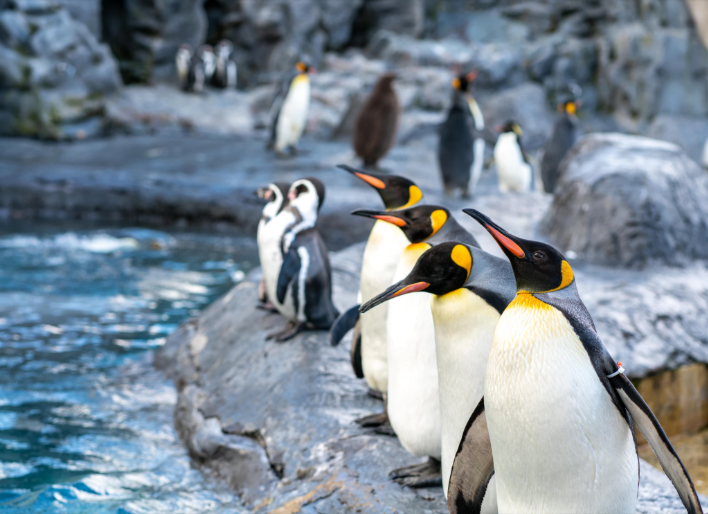
背景图像可能是所有前端开发人员在我们的职业生涯中至少使用过几次的CSS属性之一。大多数人认为背景图片没有什么不寻常的,但是。。。。。。
1.如何将背景图像完美地适合视口
body {
  background-image: url('https://images.unsplash.com/photo-1573480813647-552e9b7b5394?ixlib=rb-1.2.1&ixid=eyJhcHBfaWQiOjEyMDd9&auto=format&fit=crop&w=2253&q=80');
  background-repeat: no-repeat;
  background-position: center;
  background-attachment: fixed;
  background-size: cover;
  -webkit-background-size:
  -moz-background-size:
  -o-background-size: cover;
}
background-attachment设置背景图像是否固定或者随着页面的其余部分滚动。
2.如何在CSS中使用多个背景图片
 url(https://image.flaticon.com/icons/svg/748/748122.svg),url(https://images.unsplash.com/photo-1478719059408-592965723cbc?ixlib=rb-1.2.1&auto=format&fit=crop&w=2212&q=80); center,top; repeat,no-repeat; contain,cover;
}
3.如何创建三角背景图像
当我们想展示某些完全不同的选择(例如白天和黑夜或冬天和夏天)时。
这是通过为整个视口创建两个div来完成的,然后需要向它们两个都添加背景图像,然后,第二个div需要一个clip-path属性才能创建三角形。
<body>
  div class="day"></div="night">
</>
  margin: 0;
  padding: 0;
}

div {
  position: absolute;
  height: 100vh;
  width: 100vw;
}

.day { url("https://images.unsplash.com/photo-1477959858617-67f85cf4f1df?ixlib=rb-1.2.1&ixid=eyJhcHBfaWQiOjEyMDd9&auto=format&fit=crop&w=2613&q=80"); no-repeat;
}

.night { url("https://images.unsplash.com/photo-1493540447904-49763eecf55f?ixlib=rb-1.2.1&ixid=eyJhcHBfaWQiOjEyMDd9&auto=format&fit=crop&w=2250&q=80");
  clip-path: polygon(100vw 0,0% 0vh,100vw 100vh);
}
clip-path 属性创建一个裁剪区域,该区域设置应显示元素的哪一部分。区域内的部分显示,区域外的隐藏。
4.如何在我的背景图像上添加渐变叠加、
想在图像上放置一些文本但背景太浅文本显示不清晰时,它会很有用,同时它也可以改善图像本身
    linear-gradient(4deg,rgba(38,8,31,0.75) 30%,rgba(213,49,127,0.3) 45%,rgba(232,120,12,0.3) 100%),url("https://images.unsplash.com/photo-1503803548695-c2a7b4a5b875?ixlib=rb-1.2.1&auto=format&fit=crop&w=2250&q=80"); center
}
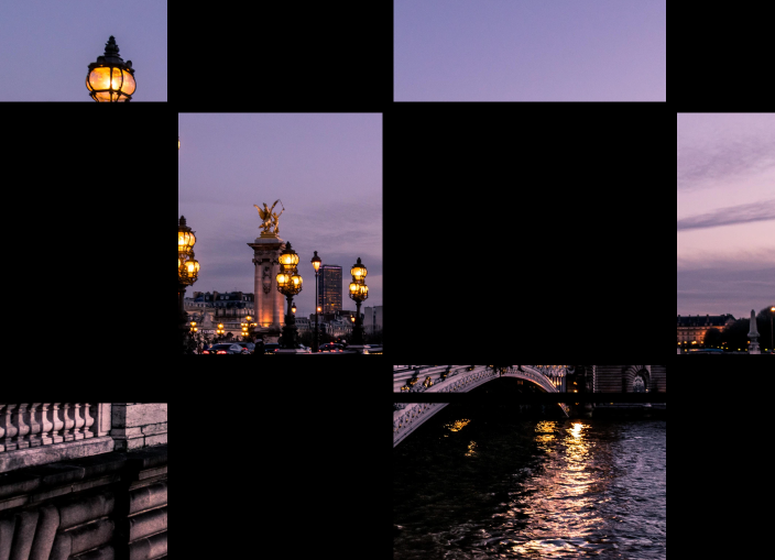
5.如何制作网格背景图片
使用CSS网格和CSS背景图像创建一个不错的背景图像
="container"="item_img"="item"
 margin:

.container { 100%;
  background: black;
  display: grid;
  grid-template-columns: 25fr 30fr 40fr 15fr;
  grid-template-rows: 20fr 45fr 5fr 30fr;
  grid-gap: 20px;
  .item_img {
    background-image: url('https://images.unsplash.com/photo-1499856871958-5b9627545d1a?ixlib=rb-1.2.1&ixid=eyJhcHBfaWQiOjEyMDd9&auto=format&fit=crop&w=2207&q=80');
    background-repeat:
    background-position:
    background-attachment:
    background-size: cover;
  }
}
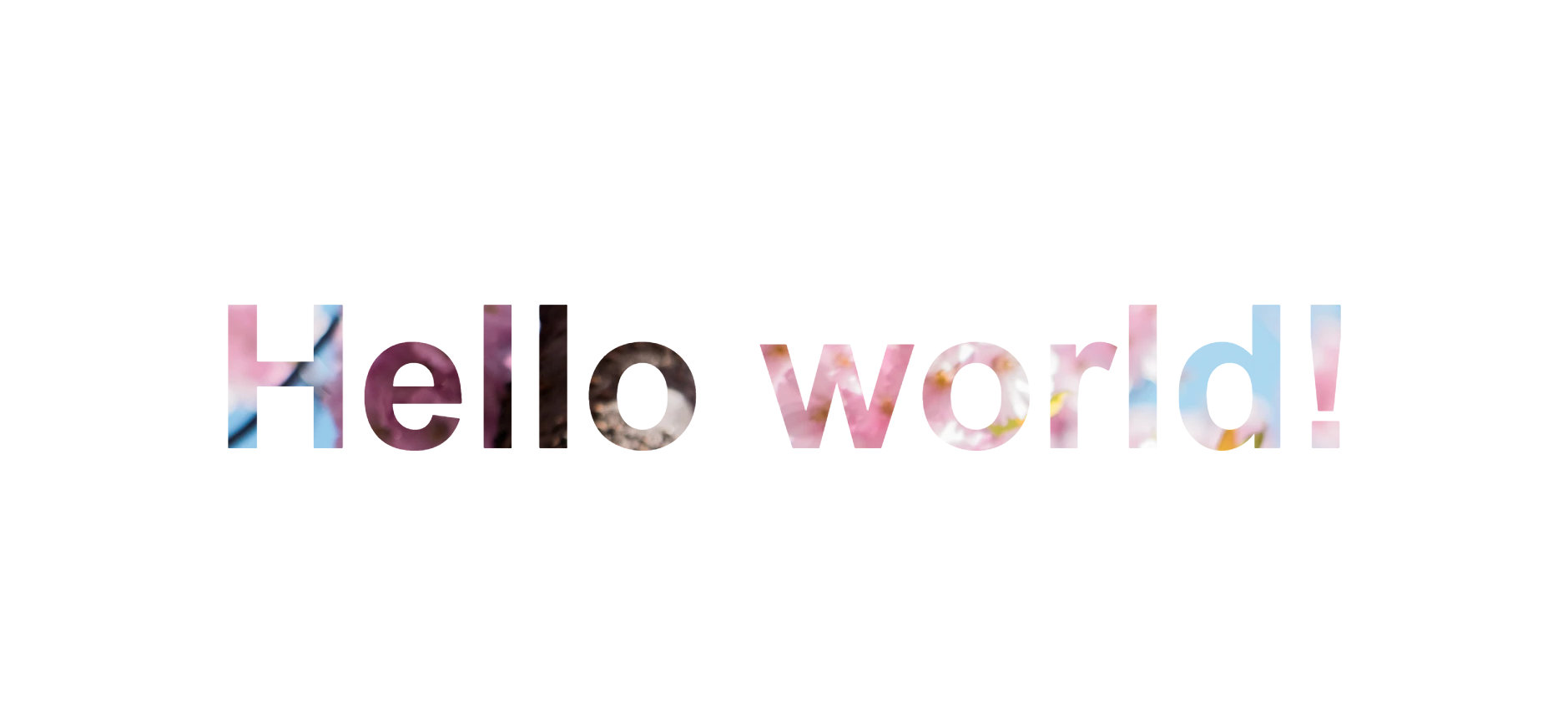
6.如何将背景图像设置为文本颜色
通过将背景图像与背景剪辑配合使用,可以实现背景图像对文字的优美效果。在某些情况下,它可能非常有用,尤其是当您想创建一个较大的文本标题但又不如普通颜色那么枯燥时。
h1>Hello world! flex;
  align-items:
  justify-content:
  flex-direction: column;
  text-align:
  min-height:
  font-size: 120px;
}

h1 {
   background-image: url("https://images.unsplash.com/photo-1462275646964-a0e3386b89fa?ixlib=rb-1.2.1&ixid=eyJhcHBfaWQiOjEyMDd9&auto=format&fit=crop&w=2600&q=80");
  background-clip: text;
  -webkit-background-clip:
  color: transparent;
}
版权声明:本文内容由互联网用户自发贡献,该文观点与技术仅代表作者本人。本站仅提供信息存储空间服务,不拥有所有权,不承担相关法律责任。如发现本站有涉嫌侵权/违法违规的内容, 请发送邮件至 dio@foxmail.com 举报,一经查实,本站将立刻删除。